d ; ECOlivery

Overview

Ever since the Covid-19 pandemic, there has been an exponential increase in delivery in general as people start to avoid leaving their homes for safety. This includes food delivery as well, and one main problem with this exponential increase in food delivery is the excessive use of plastic containers. In fact, the majority of the plastic containers are actually not recyclable because of the contamination from food residue. This means that most of the plastic containers we have recycled are most likely being landfilled, which is a serious problem to start thinking about especially because we are using more delivery plastic containers than we ever had before. In this project, I wanted to do something that can persuade people to somehow participate in settling down this issue of excessive use of plastic containers that cannot be recycled.

Service

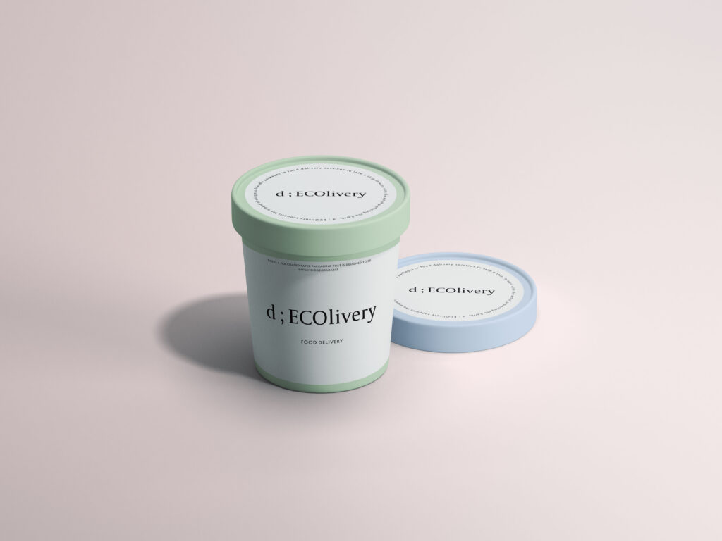
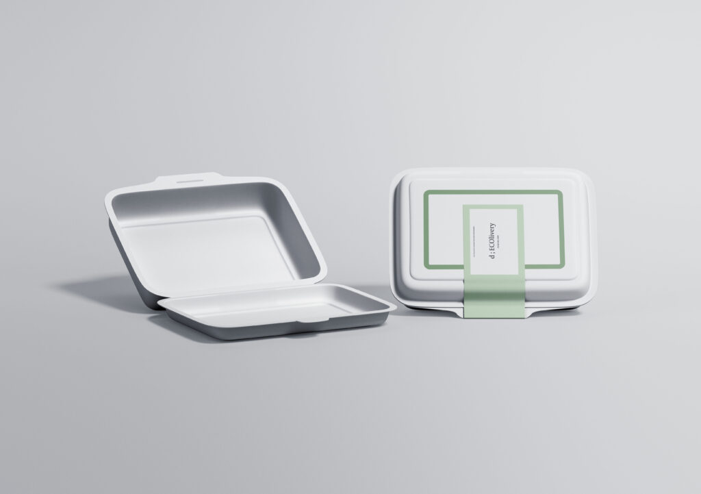
I designed a service where a delivery app creates their own eco-friendly package containers to sell as a monthly sponsorship. I’ve created my own delivery service called d ; ECOlivery, but this service can honestly be applied to any other delivery service apps as well. Restaurants will be buying the eco-friendly package containers monthly to use it for their food delivery, but this will also allow restaurants to earn sponsorship as well. 

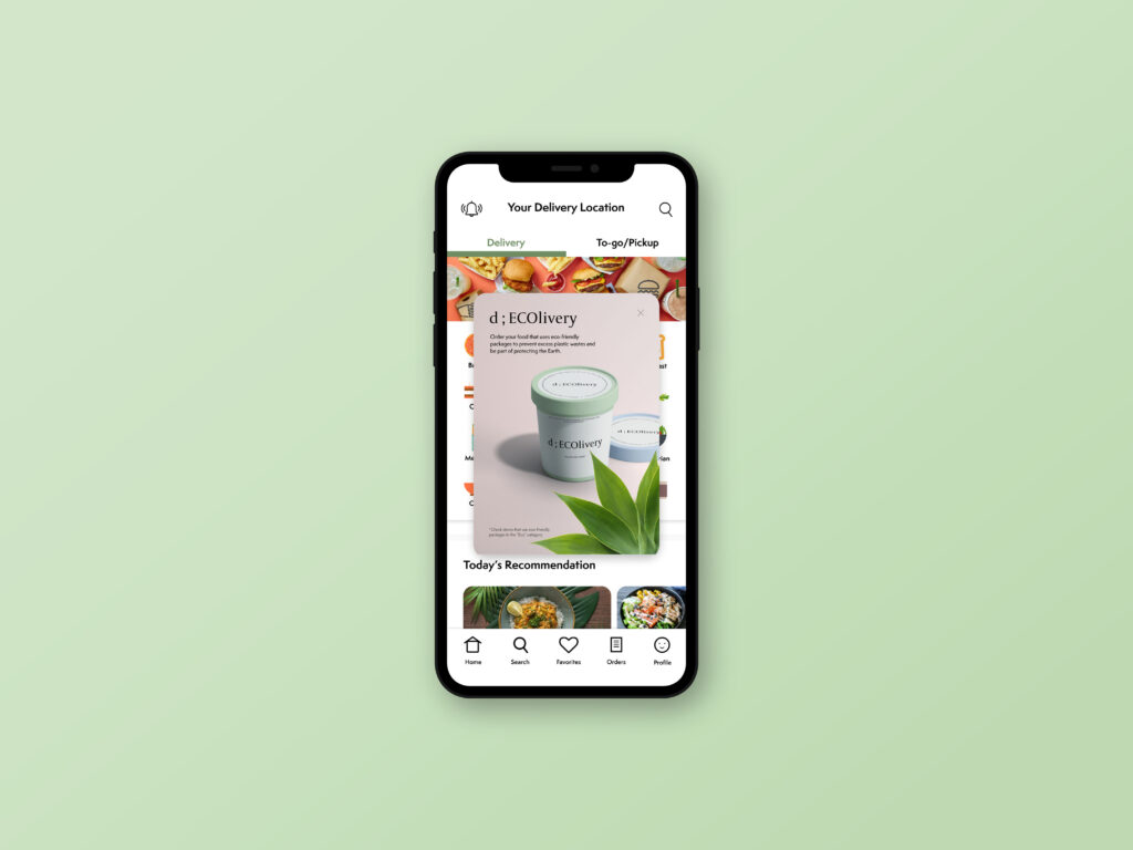
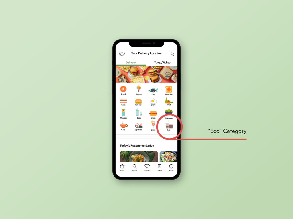
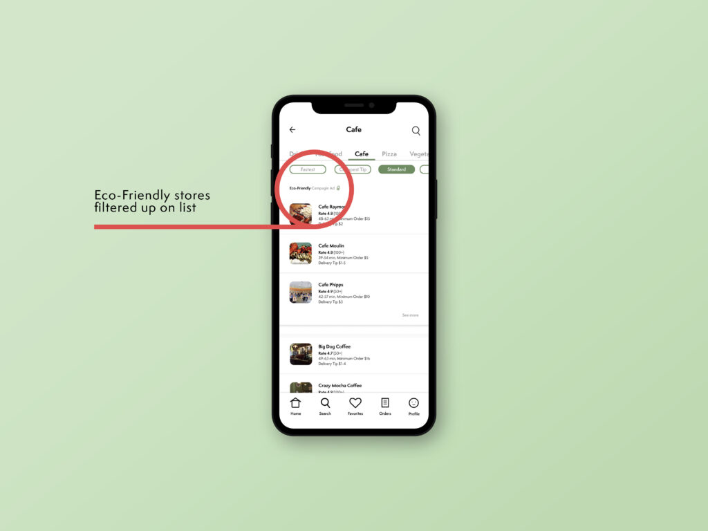
In the app, there is a pop up to notify users that eco-friendly package container service is offered in the application, and there is a separate category just for stores that use eco-friendly packaging. By making a separate category, it allows users to look at what the “eco” category is once more. Restaurants that have bought the monthly eco-friendly package containers from the service app will be sponsored and filtered up to the top of the list for each food category, which will make people look through these stores (that bought and use eco-friendly packaging) first than any other stores in the app. 

The main method I’ve used is visual persuasion and framing, where I have offered specific visuals to make people learn about the eco-friendly packaging service (like the pop-up and separate category for “eco”). In fact, the whole concept of using the sales of eco-friendly packaging as a sponsorship to filter stores to be in the top of the list is also a method of persuasion that motives users to look at stores that they see at first glance.
Mulch Monsters

A Speculative Product and Service by Ray Pai [C]

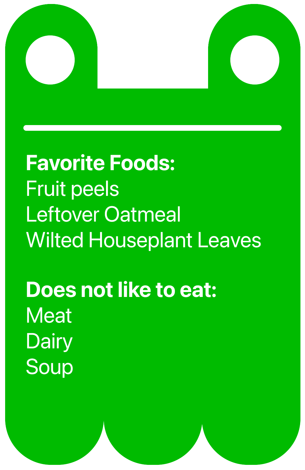
Mulch Monsters are automated composting machines that subvert the common perception of composting in homes. Food waste sent to landfills break down into methane, a greenhouse gas that depletes the ozone layer. An approach to reducing food waste is to encourage composting, which breaks food waste down into mulch. Mulch can be used in community gardens or for your own houseplants. That’s why Mulch Monster is framed as an opportunity to be health conscious and prosocial towards the community.

Mulch Monsters subvert the common misconception that composting smells bad, takes up too much space, and is labor intensive. Insted, it’s compact, automated, and educates users on how to reduce odors. In addition, it encourages behavior change by providing encouraging data through a supplementary app, which shows the quality of the mulch. Lastly, Mulch Monster is designed with the consideration of unintended consequences. With the concern that Mulch Monster makes throwing away food waste TOO fun, the supplementary app encourages users to produce quality mulch instead of large quanitites of mulch.

Nudge

Nudge: dine with joy

Angela Lee (C)Joseph Zhang (C), and Yoshi Torralva (C) / Dining service that encourages social, in-person dining

Tactics: behavior change, social proof, plain folk, emotional engagement, visual persuasion

Overview

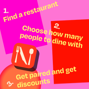
As social media algorithms push recommendations based on who you know and what you like, social circles and, as a result people’s perspectives,  have become more siloed. In order to broaden people’s relationships and minds, we are proposing a dining service that offers in-person dining experiences at discount prices with the condition that you will be dining with 2-4 strangers. 

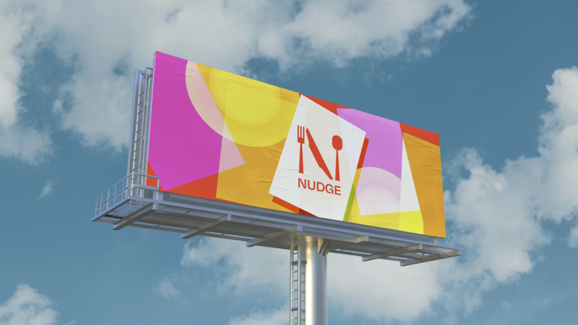
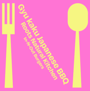
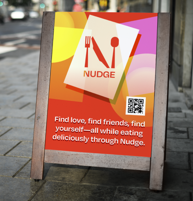
As communication designers, we relied on visual persuasion through color, typeface, and layout to create a lively, inviting mood. Studies have shown that people associate food with the colors red and yellow, so we opted for a warm color palette, paired with rounded type to evoke a friendly personality.

Social Media Campaign

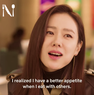
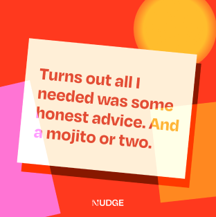
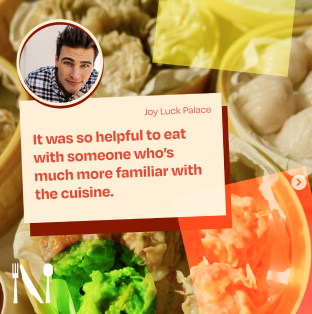
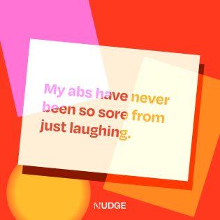
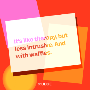
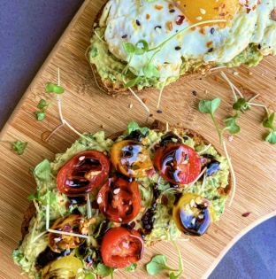
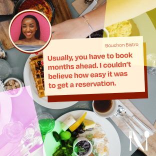
We designed a digital campaign of posts and physical merchandise to launch this new service. These posts will be spread via Facebook and Instagram’s business advertisement and catered towards young adults in busy metropolitan areas. In our social media campaign, we relied heavily on the persuasive tactic of social proof by creating reviews, crowdsourcing images and quotes from real users, and telling their stories. We also leveraged the tactic of emotional engagement particularly through the quote posts, which piques viewers’ curiosity through a catchy line and also frames the service through real users’ stories. Furthermore, we use plain folks appeal through pop culture references (e.g. our screencap with Yoon Seri from Crash Landing on You), the use of colloquial language, and humor.
Other Collateral & Signage

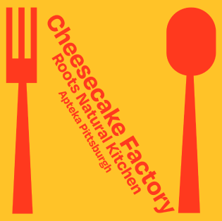
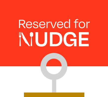
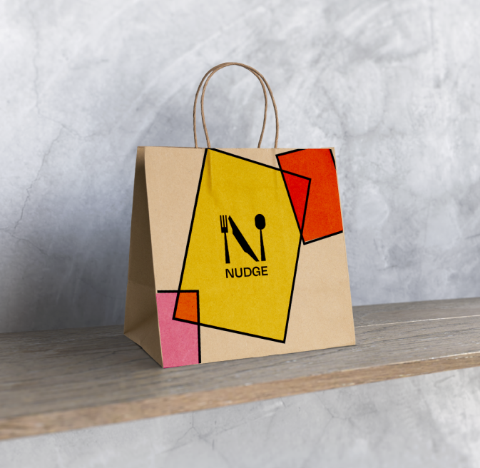
To better design for behavior change, we have design visual cues for both users and non-users alike to remind them of the service offered; thus, we designed a takeout bag and signage for restaurants.

Surfaces

Langston Wells (C) and Emily Spooner (P) / interactive photography display, packaging and CAD Modeling

Tactics: framing, behavior change, subversion, visual persuasion

As many of our experiences with media like images, text, and videos become increasingly digitized, we are headed towards a future where auditory and visual experiences outnumber experiences derived from physical artifacts. Our work highlights the affordances of tangible artifacts in a world where individuals become more and more inundated with non-tactile, digital experiences.

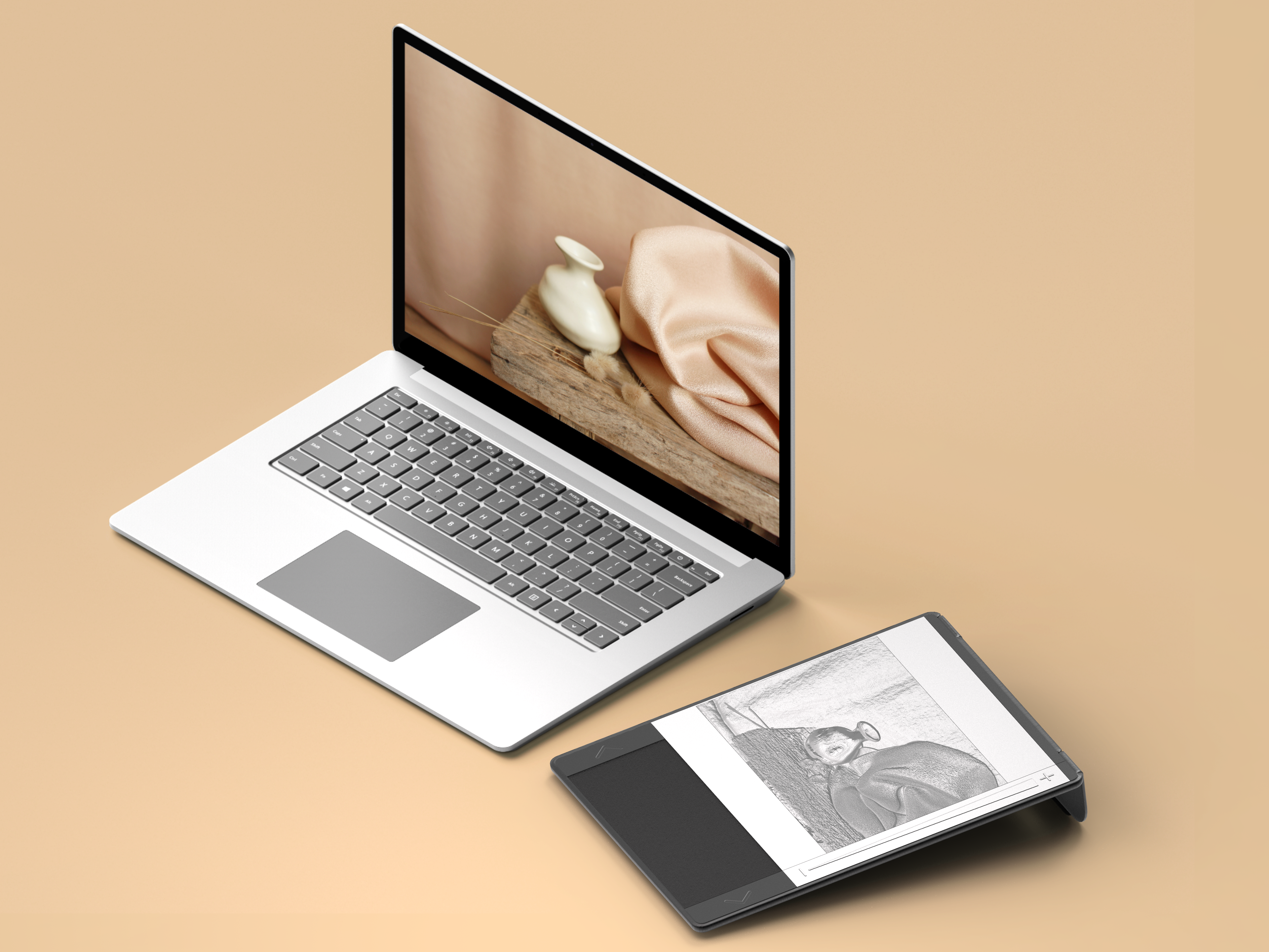
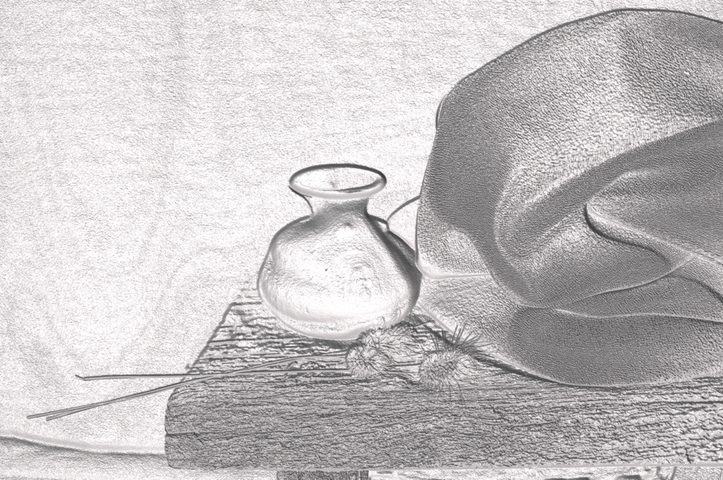
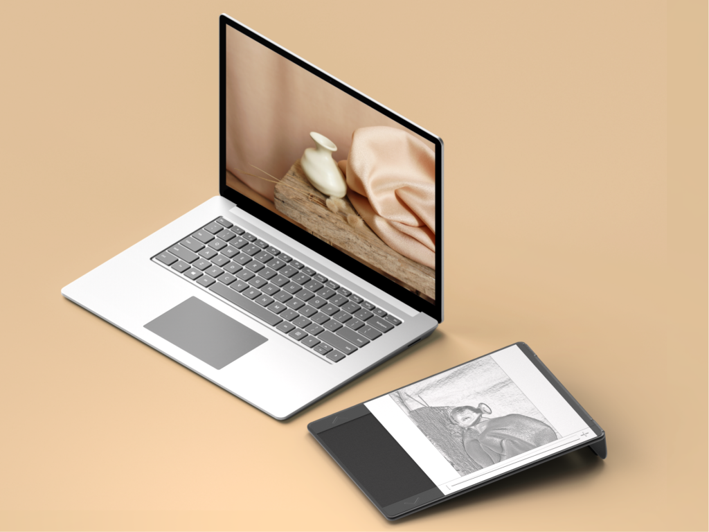
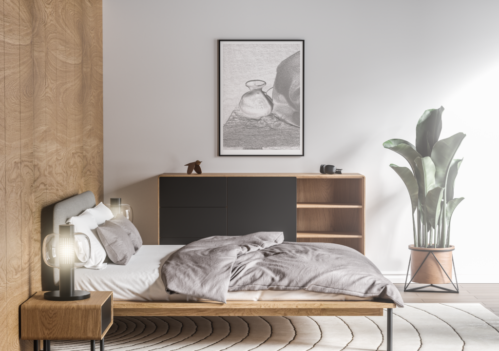
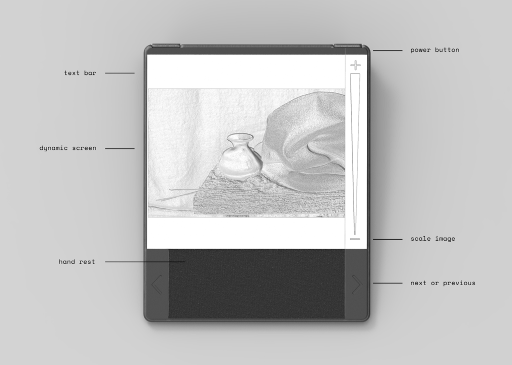
This project presents a hopeful future by translating 2D digital images into a dynamic 3D relief that users can interact through desktop and wall mounted models, heightening digital experiences like photos and video viewing while aiding accessibility for visually impaired users.

Design —

When designing this product, we were considering accessibility from all angles, from ergonomics of the surface to the user experience to our packaging design. We wanted to frame our product within a commercial, everyday setting to represent a hopeful future in which the general public understands the value of tangible products and experiences, instead of marketing only towards the visually impaired.

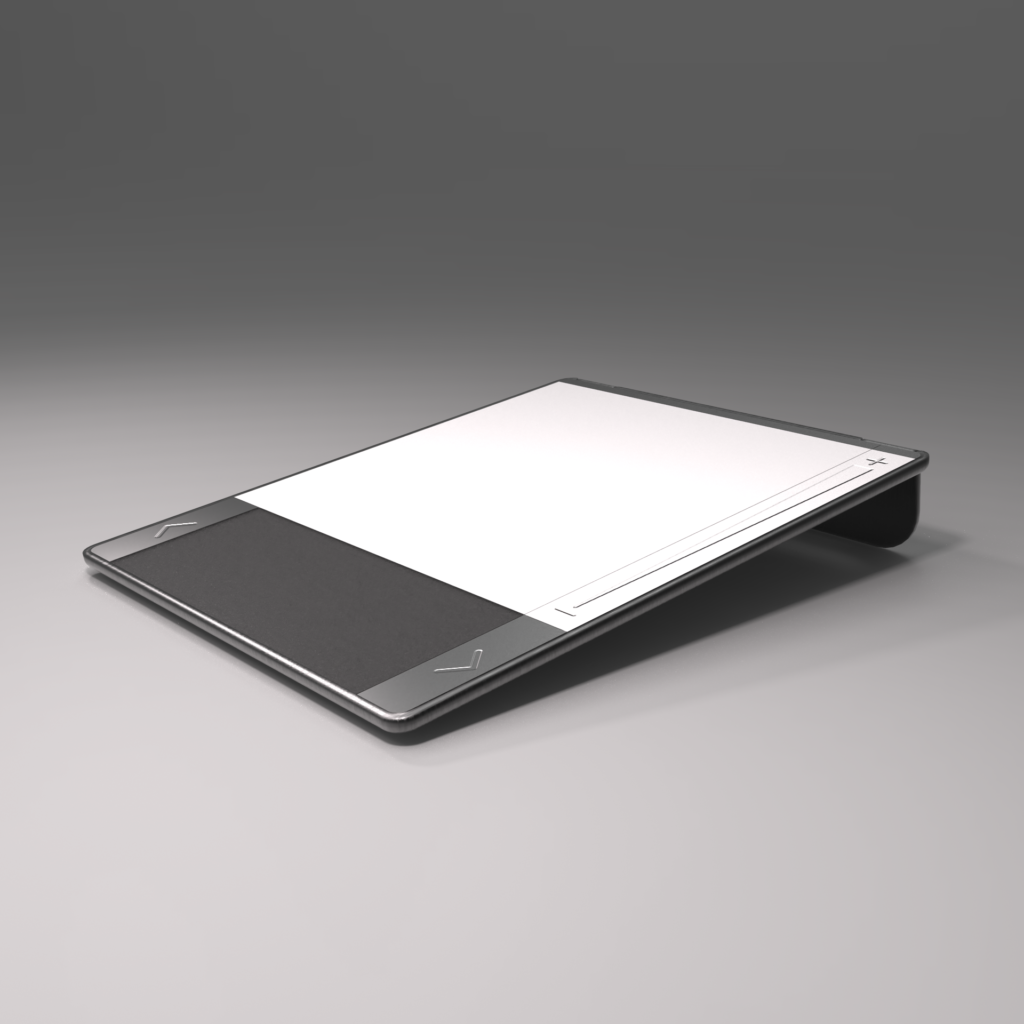
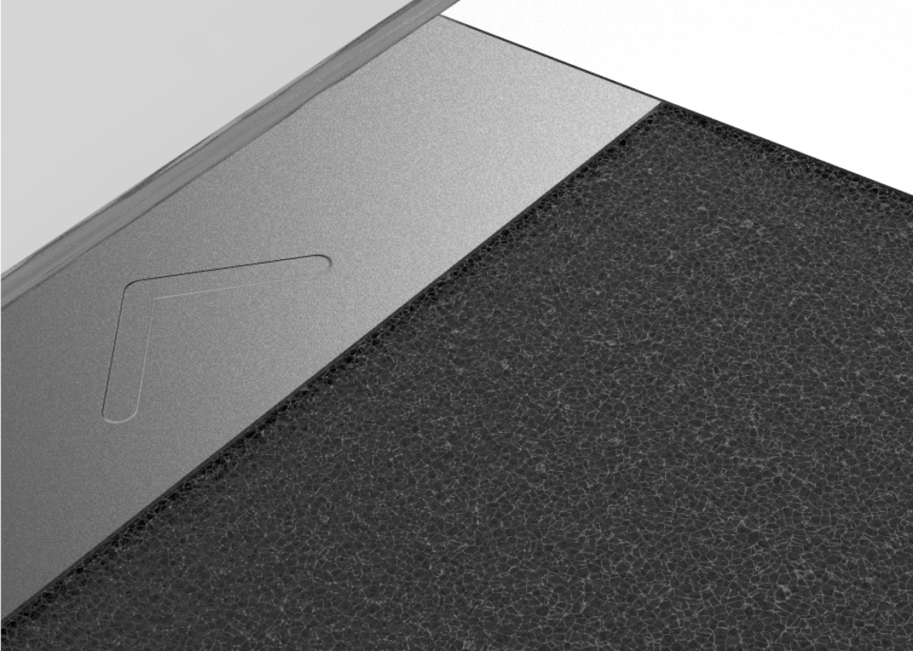
The ergonomics of the surface focus on creating a comfortable range of motion for the user’s hand by scaling buttons and sliders within easy reach for smooth interactions. This scaling helps user’s build a mental model of their hand position for ease of navigation and use. Each material was carefully considered to create unique hand feels for the user to aid memory, such as a soft, small-cell foam hand rest and brushed aluminum buttons, each with distinct textures and temperatures.
The product is designed for two use cases: one as a desktop companion for browsing photos and the other as a dynamic, wall mounted display that would be generated based on the user’s selected photo. This secondary option gives the user as well as their friends, families, or guests the ability to experience the photos in the same way but at a larger scale, which can promote conversations and new experiences. By situating it within this context, we hope to enable behavior change through socializing the interactivity of this artifact, working towards a future of greater accessibility and integration of tangible artifacts into everyday technology.

User Experience —

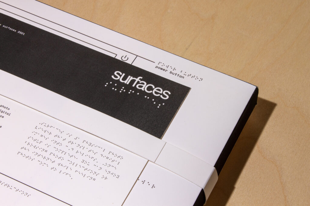
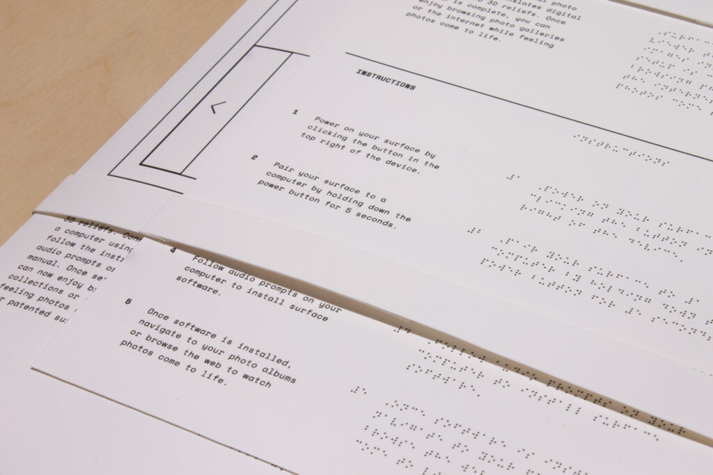
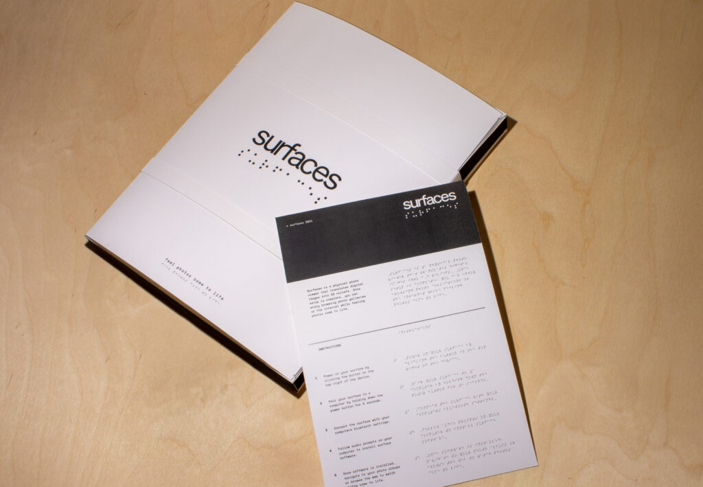
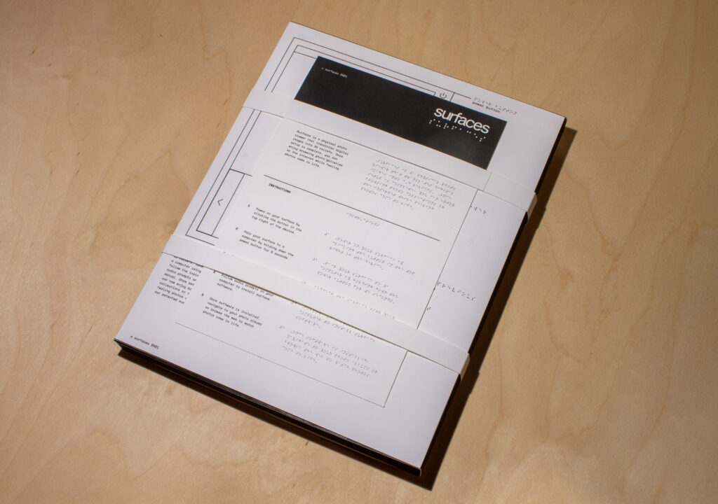
Our user experience would be derived primarily from audio prompts on the user’s computer that would help them through setup and use. The first interaction with surfaces though would be through a braille embossed instruction sheet that directs users through the initial setup and onboarding of their surface.

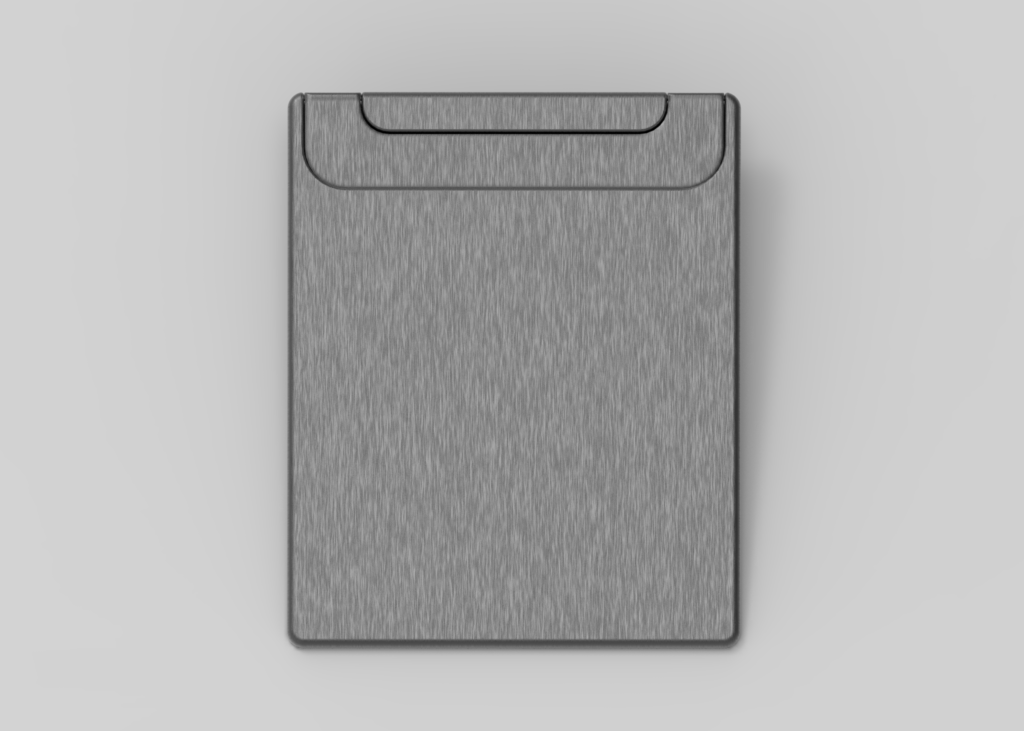
Another aspect of the user experience ties into the portability of the surface’s design as the hinged stand on the back enables user’s to place it in an upwards or downwards position, allowing it to fit into luggage, backpacks, or briefcases when traveling.

Packaging —

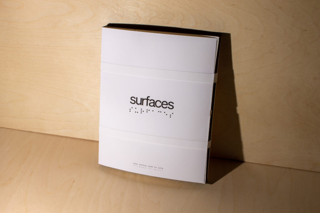
Our packaging focused on making information visible and easily understandable for visually impaired users by focusing on high contrast graphics, embossed braille directions as well as text instructions for caregivers, family, or friends who may be assisting in setup, and uncomplicated opening mechanisms with clear, tactile visual cues like finger holes and security straps for extra protection. Our final packaging would not only have the braille embossed, but also icons and diagrams at varying levels of depth so users could understand the directions from self-initiated, tactile interactions.

Below are detail shots of the instructions and packaging.