Tactics: framing, argument
Laurel Rountree(E) & Ashley Burbano(E)
What a family could look like in our present day is broad and the norms and expectations of families are constantly changing. Even still, the laws related to families have remained fairly unchanged and limit the capabilities of families that aren’t within the norm and create unhealthy stigmas that prevent people from establishing family and family roles that suits their needs in life and makes them feel fulfilled. The many norms that are used as examples when educating people about families that prevent people from seeing and understanding families that don’t fit that norm. This prevents families with unique issues from having their voice heard and the issues/discrimination they face addressed. Monogamous, heterosexual, nuclear families are the norm, but they don’t have to be. By having this norm, we have created an unintentional social heirarchy surrounding families, leading other types of families wants/needs to be devalued or not considered in certain scenarios.
The lack of awareness of diverse family types has been a major issue in the past. In U.S. education systems and elsewhere, often times the types of relationships and families discussed are very limited. For our project we designed an online learning activity for elementary and middle school age students to inform them on different types of families and the issues that they face because of certain discriminatory policies. Some examples we thought of were a single person being waitlisted for years when trying to adopt a child or a family with LGBTQ+ members in it facing certain stigmas that can cause psychological damage. The scenario we chose to present was for a chosen family trying to see a loved one in a hospital that restricts visitation to immediate family. We chose to depict this group specifically becaise we felt this family types is the least discussed type of family within the education system and so the stories and dilemas chosen families face goes unheard or misunderstood.
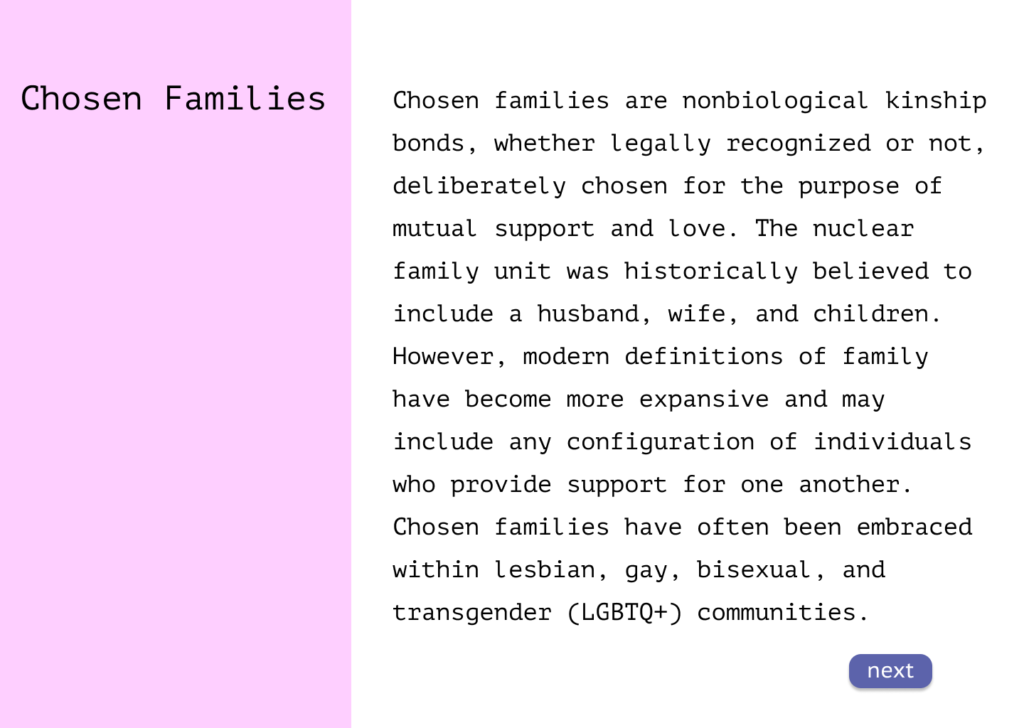
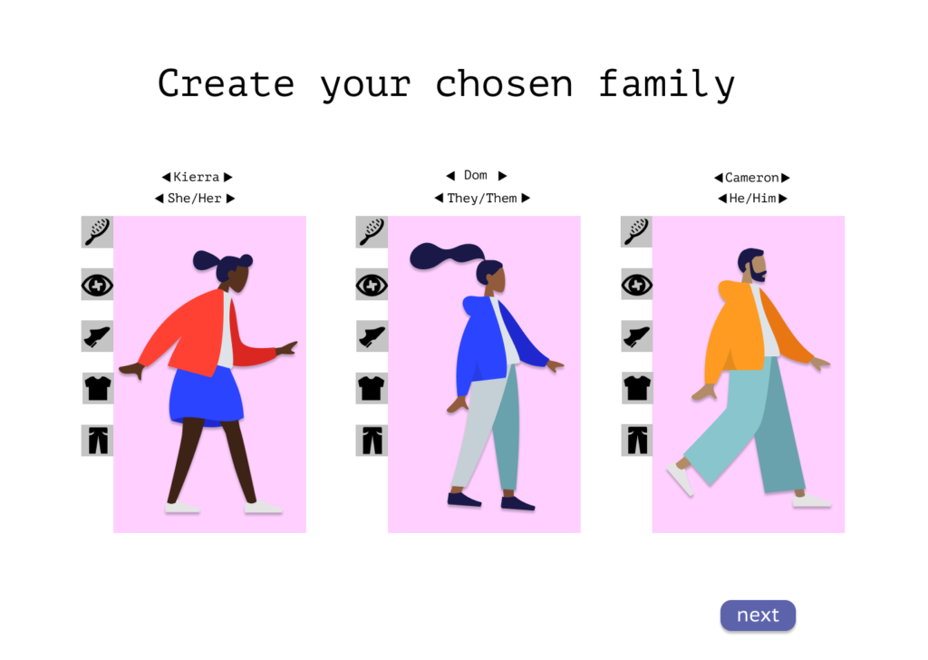
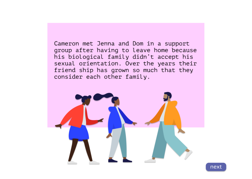
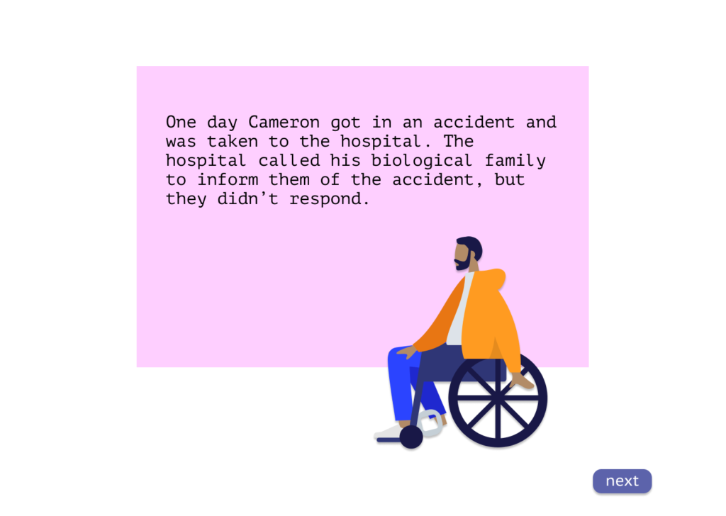
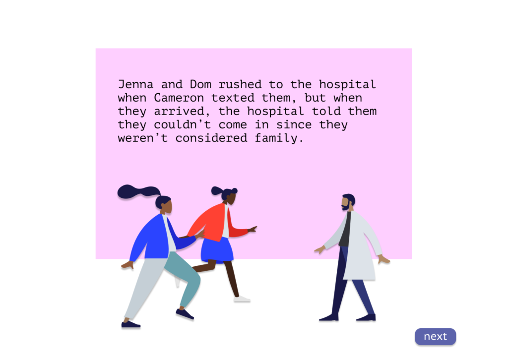
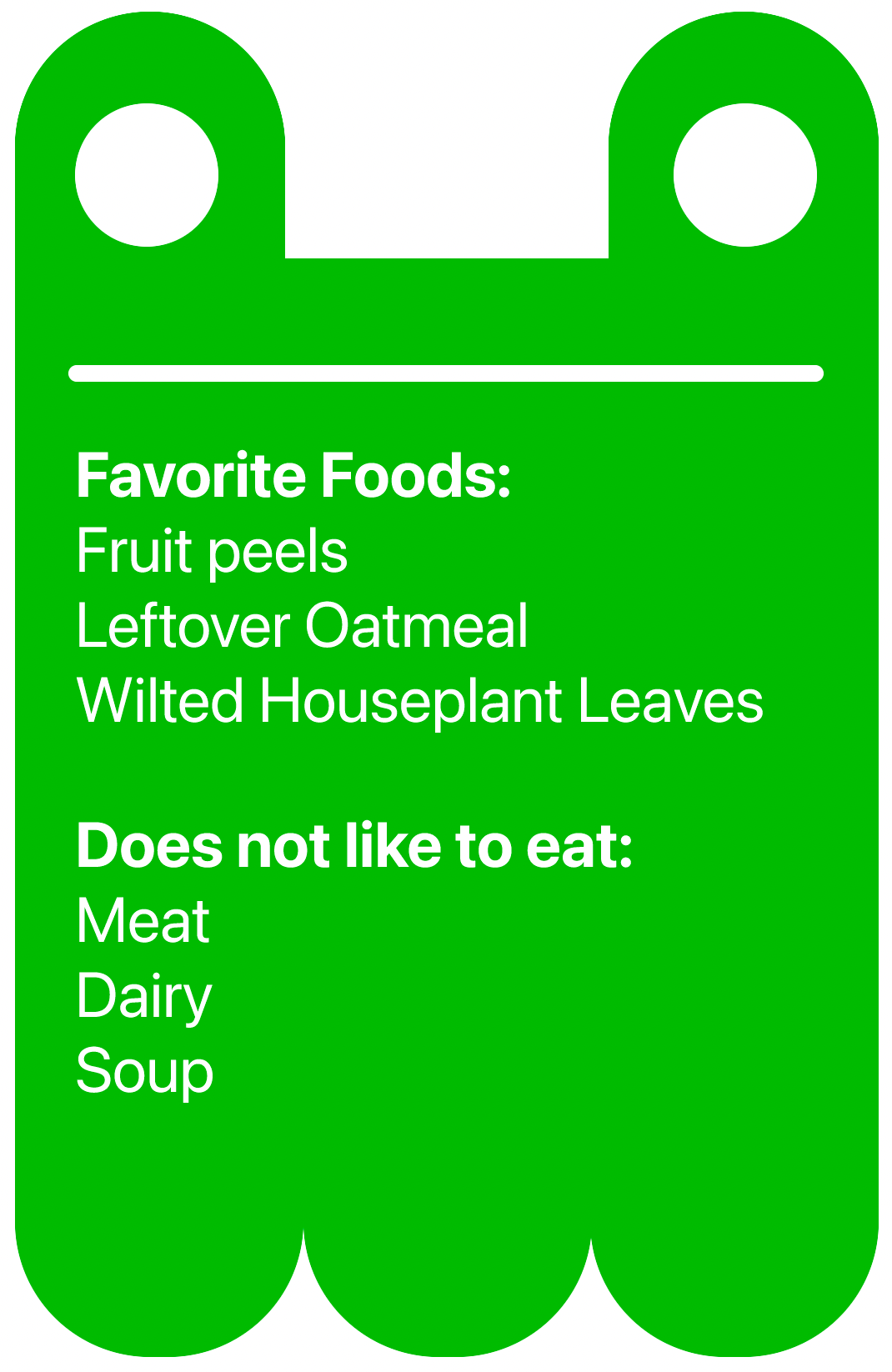
Our experience is intended to flow from learning about different family types to building them online and then informing them of narratives that these specific family types might face. At the beginning they would be prefaced with information on the experience and be asked to make a family or their family. After they finish that they would be informed on societal norms and the reality of diverse families and the need to understand their unique issues. After that, they would learn about a specific type of family and they would be asked to design the characters who will represent the people of a certain family type that will then be used in a narrative later. They would be able to change the appearance of characters as well assign names and pronouns to allow for participants to connect with the characters and feel as though they had some input into the story. When they complete this, the story will then be visualized for them using the characters they designed.
By the end of the experience we hope participants will be able to empathize with the unique problems different families and understand how societal norms around families have impacted
